1. Overview
In this tutorial, we’ll examine several ways to plot charts using the open-source Kandy library for Kotlin. This library offers a user-friendly DSL that simplifies the process of making both simple and complex charts, allowing customization without extensive documentation.
2. Project Setup
Let’s start by creating a new Kotlin project with Gradle as the build system.
With the project created, we’ll add the Kandy dependency in our build.gradle.kts file:
implementation("org.jetbrains.kotlinx:kandy-lets-plot:0.7.1")
Additionally, we’ll be using the Kotlin Statistics library, which isn’t directly available on Maven Central. Let’s add the new remote as well as the dependency:
repositories {
    maven("https://packages.jetbrains.team/maven/p/kds/kotlin-ds-maven")
}
implementation("org.jetbrains.kotlinx:kotlin-statistics-jvm:0.3.1")
When using Kandy, it’s important to note that we’re handling structured data. This data must be interpreted to be processed and displayed in a chart.
Depending on the complexity of our project and the data we need to model, we can use several approaches, from simple data structures like maps and lists to libraries like OpenCSV and Kotlin DataFrame.
For this tutorial, we’ll use Kotlin DataFrame, which provides an extensive list of methods for sorting and changing our downloaded datasets.
3. Displaying Charts
There are several options for displaying charts in Kotlin projects and interactive editors.
One option is the Kotlin Notebook plugin for IntelliJ IDE, available in the Ultimate edition. Another option is Datalore, though it requires an account to use. Jupyter Notebook is also an open-source choice for data visualization. Finally, using the Kandy library is possible in Kotlin projects on the JVM managed by Gradle, without requiring any of these notebook projects for the visualizations.
We’ll use the Kandy library together with Kotlin Statistics and we’ll create several types of charts.
4. Bar Charts
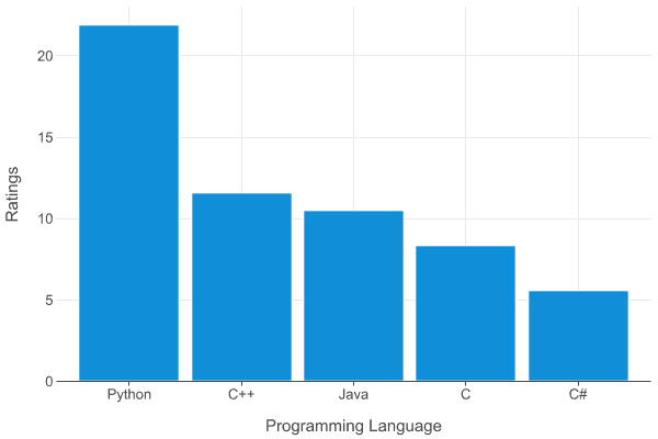
Now that we’ve explored a few ways that we might view the charts we’ll create, let’s make our first bar chart.
4.1. Dataset
Let’s add a simple map representing the top five most popular programming languages along with their ratings, based on the TIOBE Programming Community index for October 2024:
val tiobeIndex = mapOf(
    "Programming Language" to listOf("Python", "C++", "Java", "C", "C#"),
    "Ratings" to listOf(21.90, 11.60, 10.51, 8.38, 5.62)
)
4.2. Simple Bar Chart
With the data ready we can now plot our chart by using the .plot() extension function. Internally it converts the map into a DataFrame object and subsequently calls plot():
tiobeIndex.plot {
    bars {
        x("Programming Language")
        y("Ratings")
    }
}.save("TiobeIndexSimple.png")
When we run the project, the TiobeIndex.png file will be created in our project structure, under the lets-plot-images folder, which is set by default.
In addition to the file name, the save() function provides several extra parameters for customization. We can specify the file extension as SVG, HTML, PNG, JPG/JPEG, or TIFF, along with the scale, DPI, and folder path for saving the image:
4.3. Adding Customizations
Additionally, we can customize the chart to change the colors, bar widths, and other metadata. Let’s customize our chart to enhance it even further.
First, we create a DataFrame object with the toDataFrame() function, then reverse the order of the elements in the map with reverse().
Second, we change the chart type to barsH, plotting it horizontally, along with extra options like alpha and fillColor(), which adjust the transparency and colors of the bars.
Finally, we’ll add layout() options containing caption, subtitle, and size:
tiobeIndex
  .toDataFrame()
  .reverse()
  .plot {
      barsH {
          x("Ratings")
          y("Programming Language")

          alpha = 0.75
          fillColor("Programming Language") {
              scale = categoricalColorHue(chroma = 80, luminance = 70)
              borderLine.color = Color.BLACK
              borderLine.width = 0.5
              legend.name = "Programming\n Language"
          }
      }

      layout {
          title = "Tiobe Index October 2024"
          subtitle = "Top 5 Programming Languages"
          caption = "Source: www.tiobe.com"
          size = 800 to 600
      }
  }.save("TiobeIndexCustom.png")
}
Now that we’ve added several customizations, let’s check out the results:
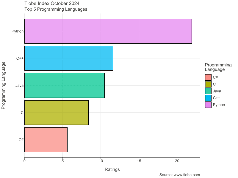
With the changes to the chart’s plotting, it’s now more readable, making the programming languages and ratings easier to distinguish.
5. Candlestick Charts
Now that we’ve created our first simple bar chart, let’s move on to a more complex chart type: the candlestick chart. This chart is commonly used to display data over time, with open and close values and wicks that show value fluctuations within each period.
5.1. Dataset
For this dataset, we’ll use the past year’s daily Bitcoin price data from CoinMarketCap. Once downloaded, let’s add it to our resources folder and use DataFrame to read the CSV file:
val bitcoinData = DataFrame.readCSV(
  "src/main/resources/Bitcoin Historical Data.csv",
  delimiter = ';'
)
We can get a sense of the CSV data by using the describe() function:
bitcoinData.describe().print()
5.2. Simple Candlestick Chart
With the Bitcoin dataset ready to use, let’s plot a candlestick chart.
To achieve this, we use the candlestick() function, passing in the date first, followed by the open, high, low, and close prices. In our case, we provide the timestamp, open, high, low, and close values as strings to match the CSV column titles:
bitcoinData.plot {
    candlestick("timestamp", "open", "high", "low", "close")
}.save("BitcoinCandlestickSimple.png")
Once we run the project, we can check the results:
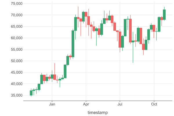
The resulting chart is readable but we can do better with more customizations.
5.3. Calculating the Moving Average
We’ll need a function to calculate the moving average, depending on a list of closing prices and a window size:
val windowSize = 7;
fun calculateMovingAverage(windowSize: Int, data: List<Double>) : List<Double?> {
    val closePrices = data.toList()

    return List(closePrices.size) { index ->
        if (index < windowSize - 1) null
        else {
            val window = closePrices.subList(index - windowSize + 1, index + 1)
            window.sum() / window.size
        }
    }
}
Next, let’s extract the closing prices and process them:
val movingAverages = bitcoinData["close"].toList().map { it as Double }

val movingAverage = calculateMovingAverage(windowSize, movingAverages)
We’re now ready to start plotting the enhanced chart.
5.4. Candlestick Chart Customization
First, we name our x and y axis Date and Price.
Second, by using the alpha() function, we set the transparency levels based on whether the price increased or decreased by using the Stat.isIncreased helper from the Statistics library. Inside the code block for the function, we set the scale to categorical() effectively mapping a set of categories to corresponding values, in this example, using the pairs true to 1.0 and false to 0.05. With this option set, we control the alpha for increasing and decreasing candles. Additionally, we add a legend and use the breaksLabeled() function to assign categories to their respective values.
Third, we set the candlesticks’ fill and border colors together with the width to give them some spacing.
Last, we set some layout details, which include the title and the size of the chart:
bitcoinData.plot {
    candlestick("timestamp", "open", "high", "low", "close") {
        x.axis.name = "Date"

        alpha(Stat.isIncreased) {
            scale = categorical(true to 1.0, false to 0.05)
            legend {
                name = ""
                breaksLabeled(true to "Increase", false to "Decrease")
            }
        }
        fillColor = Color.GREEN
        borderLine.color = Color.GREY
    }

    line {
        y(movingAverage)
        x("timestamp")
    }

    layout {
        title = "BTC/USD"
        size = 800 to 500
    }
}.save("BitcoinCandlestickCustom.png")
Finally, let’s run our project and check the results:
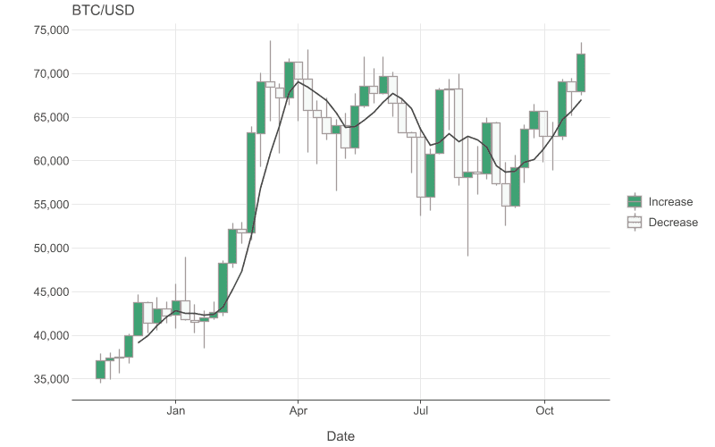
Notably, our previously calculated moving average line is also drawn on the candlestick chart to make it more informative.
6. Multiplot Charts
With candlesticks done, let’s examine the multiplot chart, which can display multiple datasets in one.
6.1. Dataset
For this type of chart, we’ll be using the BigMac index data from The Economist which we add to our resource folder and assign to a variable:
val bigMacData = DataFrame.readCSV("src/main/resources/BigMac Index.csv")
Let’s start by sorting the bigMacData first, along with selecting a sub-set of the countries:
val sortedBigMacData = bigMacData
  .filter { it["name"] in listOf("United States", "Canada", "China", "Euro area") }
  .sortBy("name")
6.2. Multiplot Chart Customization
We plot the chart with the points() function, which displays the prices as dots.
Next, we enhance the dots by adding color and increasing their size.
Then, to plot multiple charts at once, we use the facetWrap() function, specifying the desired number of columns.
Finally, we set up the layout by adding a title, subtitle, and adjusting the size:
sortedBigMacData.plot {
    points {
        x("date") {
            axis.name = "Date"
        }
        y("dollar_price") {
            scale = continuous(0.0..8.0)
            axis.name = "USD Price"
        }

        color("name")
        size = 2.0
    }

    facetWrap(nCol = 2) {
        facet(bigMacData["name"])
    }

    layout {
        title = "Big Mac Index"
        subtitle = "USD Price of a Big Mac in Different Countries"
        size = 800 to 600
    }
}.save("BigMacData.png")
Now let’s run the project and check the results:
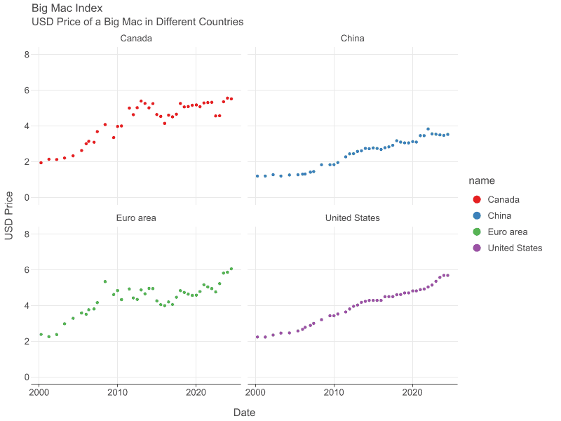
We now have four separate charts in one image, so that we can easily compare these differing data sets in a concise graphic.
7. Conclusion
In this article, we’ve explored several methods for plotting charts—from interpreting and manipulating data to customizing its display in various formats.
Although we haven’t covered all the available plotting options, it’s clear that Kandy is a versatile library with many charting options and capabilities.