1. Introduction
Matplotlib is a Python visualization library for drawing various plots and diagrams, such as lines, box plots, bar plots, and pie charts. It is pretty versatile and supports 3D graphics.
In this tutorial, we’ll explore how to include multiple diagrams in the same Matplotlib figure.
We’ll show:
- how to position subplots in a rectangular grid
- and how to let subplots span cells in several columns and/or rows.
2. Why Do We Need Multiple Subplots?
Let’s say a video content creator analyzes the performance of their videos, classified into three types (A, B, and C). The goal is to discover the satisfaction level with these types in three demographic groups (teenagers under 18, young adults, and adults) and tailor the topics to maximize viewers’ interest.
For the analysis, the creator computes the average monthly viewer ratings for all combinations of types and demographic groups over the previous year. So, there are 3* 3 * 12 = 108 data points.
Showing them all in a single plot will make it unreadable. On the other hand, creating nine individual plots for combinations of types and groups will split the information and make the comparison harder.
However, visualizing the plots in the same figure reveals the trends clearly and immediately.
2.1. Data
We’ll assume that the data are in a numpy array ratings whose shape is (3, 3, 12):
- rows correspond to three video types
- columns denote the three demographic groups
- there are twelve values in each row and column for twelve monthly average ratings
We’ll simulate the mean ratings for each combination of group and video type as linear trends using numpy:
import numpy as np

ratings = np.zeros((3, 3, 12))

for i in range(3): # video type, rows
    for j in range(3): # dem group, columns
        baseline = 1 + 0.4 * i
        y = baseline + 0.08 * np.arange(1, 13) * (j + 1)

        ratings[i, j, :] = y
3. Arrange Multiple Subplots in a Grid Using subplots()
The subplots() method of class Figure specifies a grid of subplots and returns an array of Axes objects, each a handle for one subplot in the grid.
Let’s create a simple 3-times-3 grid:
import matplotlib.pyplot as plt

figure = plt.figure(figsize=(15, 5))

axs = figure.subplots(nrows=3, ncols=3)

xs = np.arange(1, 13)

colors = ['#557bdc', '#cdb775', '#ff786b']
markers = ['o', 's', '^']

for i in range(3):
    for j in range(3):
        axs[i, j].plot(xs, ratings[i, j], color=colors[i], marker=markers[i])
What happens here?
- We instantiate the figure 15 inches wide and 5 inches high (check our tutorial for customizing the figure size in Matplotlib for more info)
- We use the numbers 1-12 to represent the months on the x-axis.
- The call to subplots(nrows=3, ncols=3) returns a 3-times-3 array of Axes, which we see as a 3-times-3 grid.
- The object axs[i, j] references the plot in the i-th row and j-th column (0-indexed).
- We use different colors and marker shapes in each row to improve clarity.
Here’s the figure:
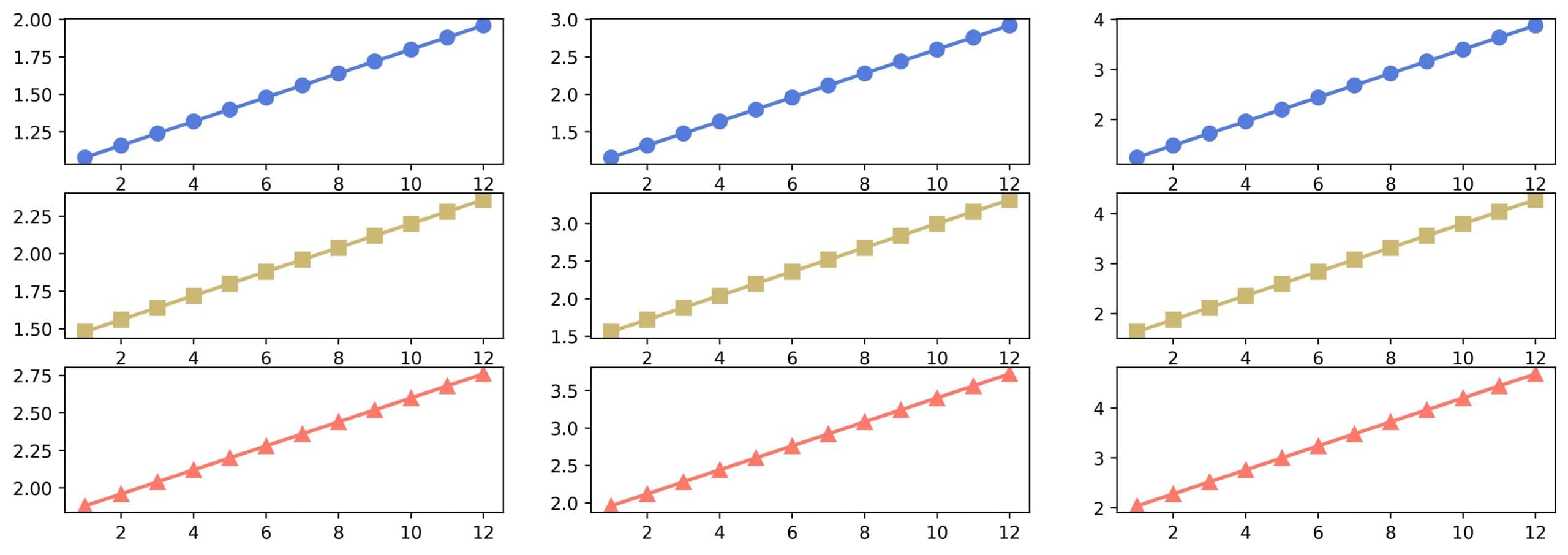
Although it contains multiple subplots as we wanted, there are a few flaws:
- The month ticks and labels are repeated on the x-axis in each subplot, wasting space
- The y-values in each subplot have different ranges, making it more difficult to compare trends across video types and demographic groups
- There are no headers to show us which subplot corresponds to which video type and demographic group
We can solve the first two issues with axis sharing.
3.1. Axis Sharing
When two plots share an axis, they’ll have the same ticks. The ticks’ range of the shared axis must cover the range wide enough to accommodate all the subplots. Additionally, sharing affects the repetition of tick labels.
*We can control sharing of the x and y axes with the parameters sharex and sharey of subplots().* Each can take one of the following values:
- True or ‘all’: all the subplots will share the corresponding axis
- False or ‘none’: axis sharing isn’t enforced
- ‘col’: the subplots in the same column will share the corresponding axis.
- ‘row’: the subplots in the same row will share the corresponding axis.
If sharex is set to True, ‘all’, or ‘col’, only the bottom subplots in each column will show the tick labels. Similar goes for the leftmost subplots when we set sharey to True, ‘all’, or ‘row’.
In our example, we need to change only the call to subplots():
axs = figure.subplots(
  nrows=3,
  ncols=3,
  sharex=True,
  sharey=True)
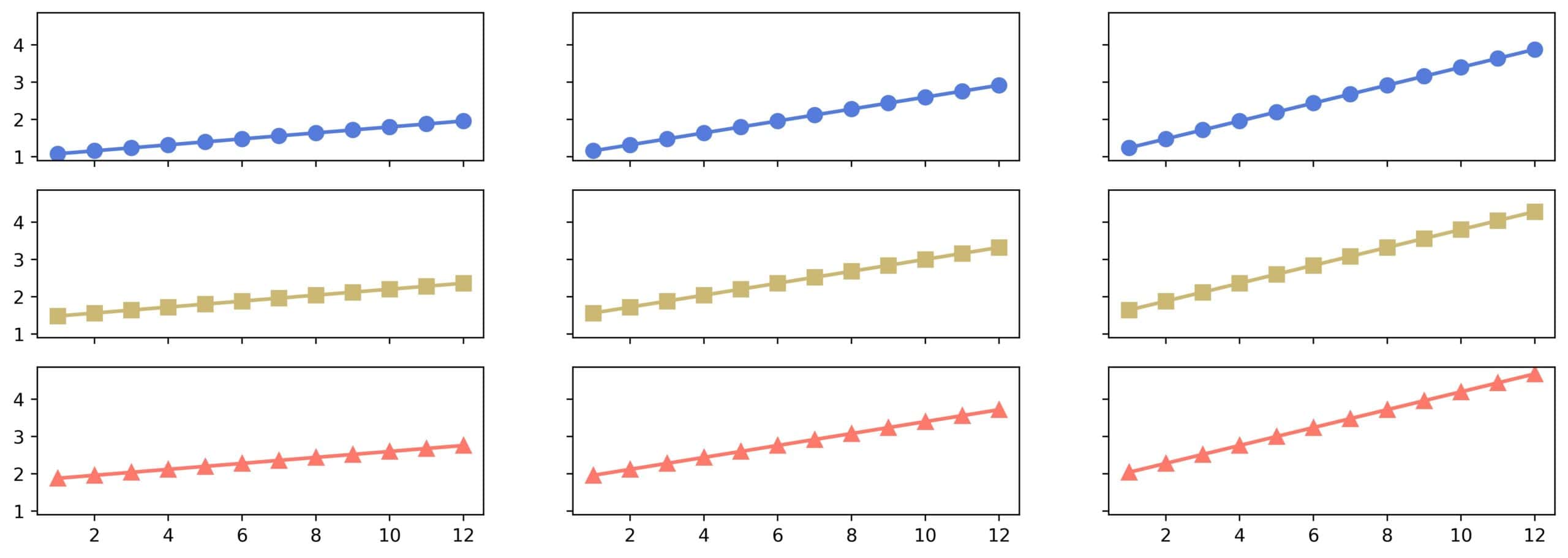
Now, the y-axis ranges are the same, and the subplots in the same column share the same x-axis:
3.2. Specifying the Ticks and Labels
We can explicitly tell Matplotlib to use the same tick values and labels for an axis in all the subplots.
To do so, we pass a dictionary of specified values and labels as the subplot_kw parameter of subplots():
months = ['Jan', 'Feb', 'Mar', 'Apr', 'May', 'Jun', 'Jul', 'Aug', 'Sep', 'Oct', 'Nov', 'Dec']

subplot_specification = {
    'xticks' : range(1, 13),
    'yticks' : range(1, 6),
    'xticklabels' : months,
    'ylim' : (0.5, 5.5)
}

axs = figure.subplots(
  nrows=3,
  ncols=3,
  sharex=True,
  subplot_kw=subplot_specification)
Here:
- xticks and yticks specify the ticks on the x and y axes
- xticklabels specifies the labels of the x-ticks
- if we wanted to, we could set the labels of the ticks on the y-axis using yticklabels
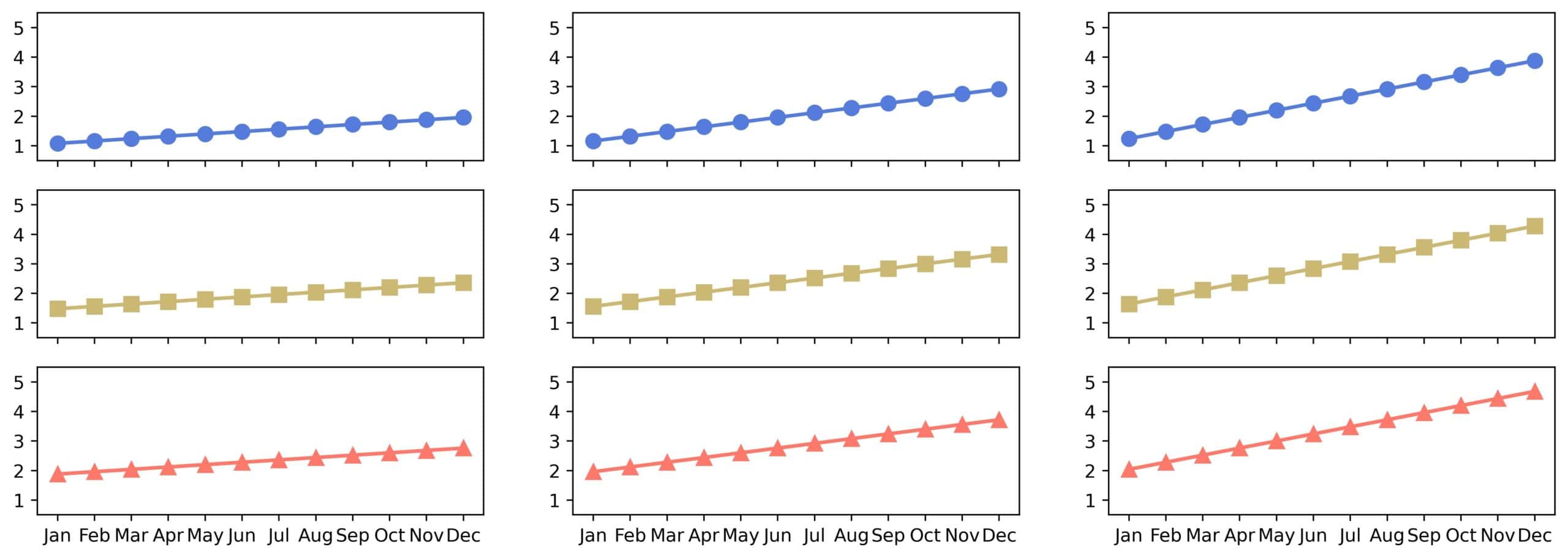
Without activating axis sharing with sharex or sharey, the tick labels will be repeated in every subplot.
In our example, the y-tick labels don’t make the figure unreadable, unlike the month names on the x-axis.
This is the result:
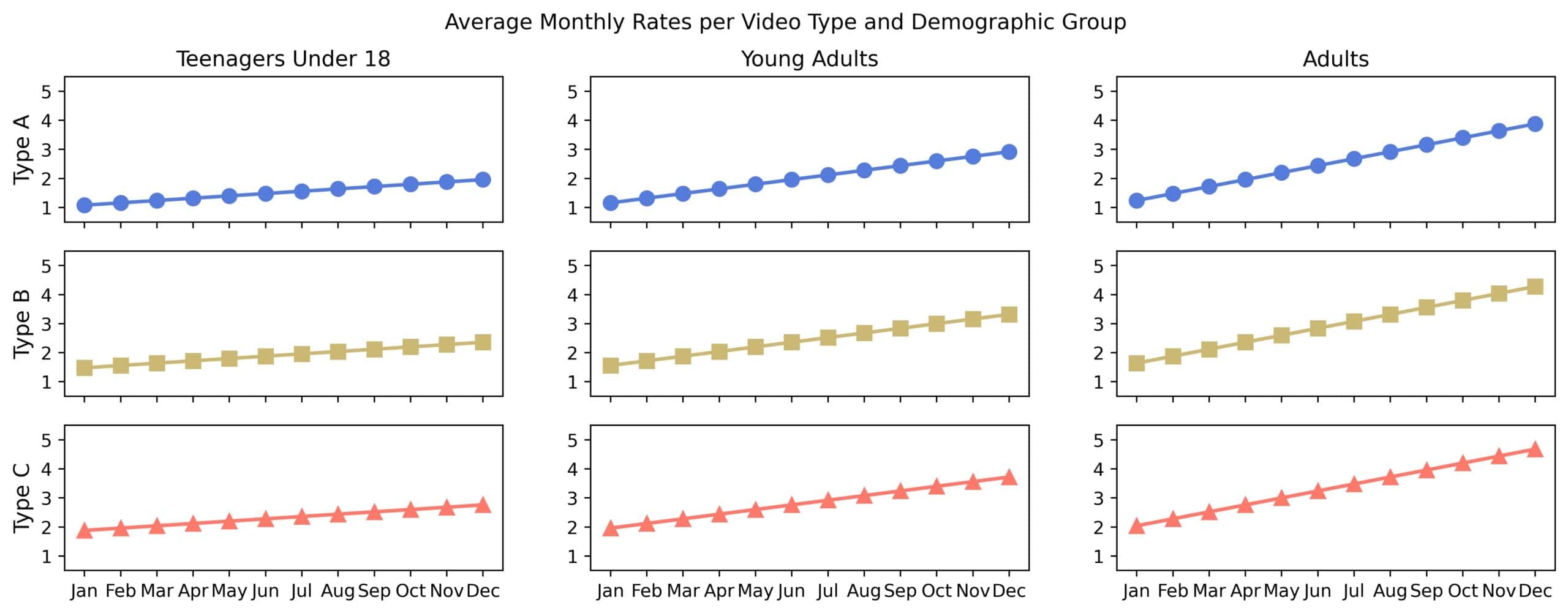
3.3. Figure Title and Headers
To set the figure title, we use the suptitle() method of the Figure object:
figure.suptitle('Average Monthly Rates per Video Type and Demographic Group')
By the definition of the data, the columns correspond to demographic groups and rows to video types.
colors = [‘#557bdc’, ‘#cdb775’, ‘#ff786b’]
markers = [‘o’, ‘s’, ‘^’]
A quick and dirty way to set column and row headers is:
- use the titles of the subplots in the top row as column headers
- use the y-axis labels of the subplots in the leftmost column as row headers
row_names = ['Type A', 'Type B', 'Type C']
column_names = ['Teenagers Under 18', 'Young Adults', 'Adults']

xs = np.arange(1, 13)

colors = ['#557bdc', '#cdb775', '#ff786b']
markers = ['o', 's', '^']

for i in range(3):
    for j in range(3):
        axs[i, j].plot(xs, rates[i, j], color=colors[i], marker=markers[i])
        if i == 0:
            axs[i, j].set_title(column_names[j])
        if j == 0:
            axs[i, j].set_ylabel(row_names[i], fontsize=12)
We manually adjusted the font size of the y-axis labels to match the size of the titles. Here’s how the figure looks now:
3.4. The Summary of subplots()
This method returns the Axes objects, arranged in an array of the shape (nrows, ncols). We can control axis sharing through sharex and sharey, but there are other parameters we can set. Here’s the complete specification:
Parameter
Meaning
Default
nrows
The number of rows
1
ncols
The number of columns
1
sharex
Defines whether and how to share the y-axis
False
sharey
Defines whether and how to share the y-axis
False
squeeze
If True, flattens the two-dimensional output array of Axes into a one-dimensional array.
False (keeps the grid structure in the output)
width_ratios
Sets the columns’ relative widths. The width of the j-th column is width_ratios[j]/sum(width_ratios).
None (all column widths are equal)
height_ratios
Sets the rows’ relative heights like as the parameter width_ratios controls the columns’ widths.
None (all rows heights are equal)
subplot_kw
A dictionary of parameters we want to set for all the subplots.
None
gridspec_kw
A dictionary setting additional grid options.
None
Furthermore, we can create the figure and set its subplot structure in one step using the subplot() function from matplotlib.pyplot we imported as plt:
figure, axes = plt.subplots(nrows=3, ncols=3)
In addition to Axes, we obtain a handle for the instantiated Figure.
4. Span Rows or Columns in a Mosaic Structure Using subplot_mosaic()
The grid structure we previously studied is rectangular.
However, in some cases, we may want to specify an irregular subplot structure, where a subplot can span neighboring cells in multiple columns or rows.
For this, we use the subplot_mosaic() method of Figure. Its mandatory argument specifies the irregular structure, which we call the mosaic layout.
4.1. The Mosaic Layout
The mosaic layout specifies which cells in the grid should be occupied by which subplot. It does so by defining rows as lists of subplot identifiers, which are usually strings, but we can use any hashable type.
As a result, a subplot spans the consecutive cells in the same row or neighboring rows marked with its identifier.
Here’s an example:
[
  ['A', 'A', 'B'],
  ['A', 'A', 'B'],
  ['C', 'D', 'B']
]
There are four subplots in this layout:
- B spans the third column.
- A spans the first two cells of the first two rows.
- The remaining two cells are subplots C and D.
If every identifier is a character, the layout can be specified as a string:
'''
AAB
AAB
CDB
'''
We can write it more compactly using the semicolumn as the row separator:
'AAB;AAB;CDB'
If we don’t want a cell to be unoccupied by any plot, we use the dot as its identifier. That’s the default identifier of an empty cell, but we can define our own in the call to subplot_mosaic() by setting the empty_sentinel parameter.
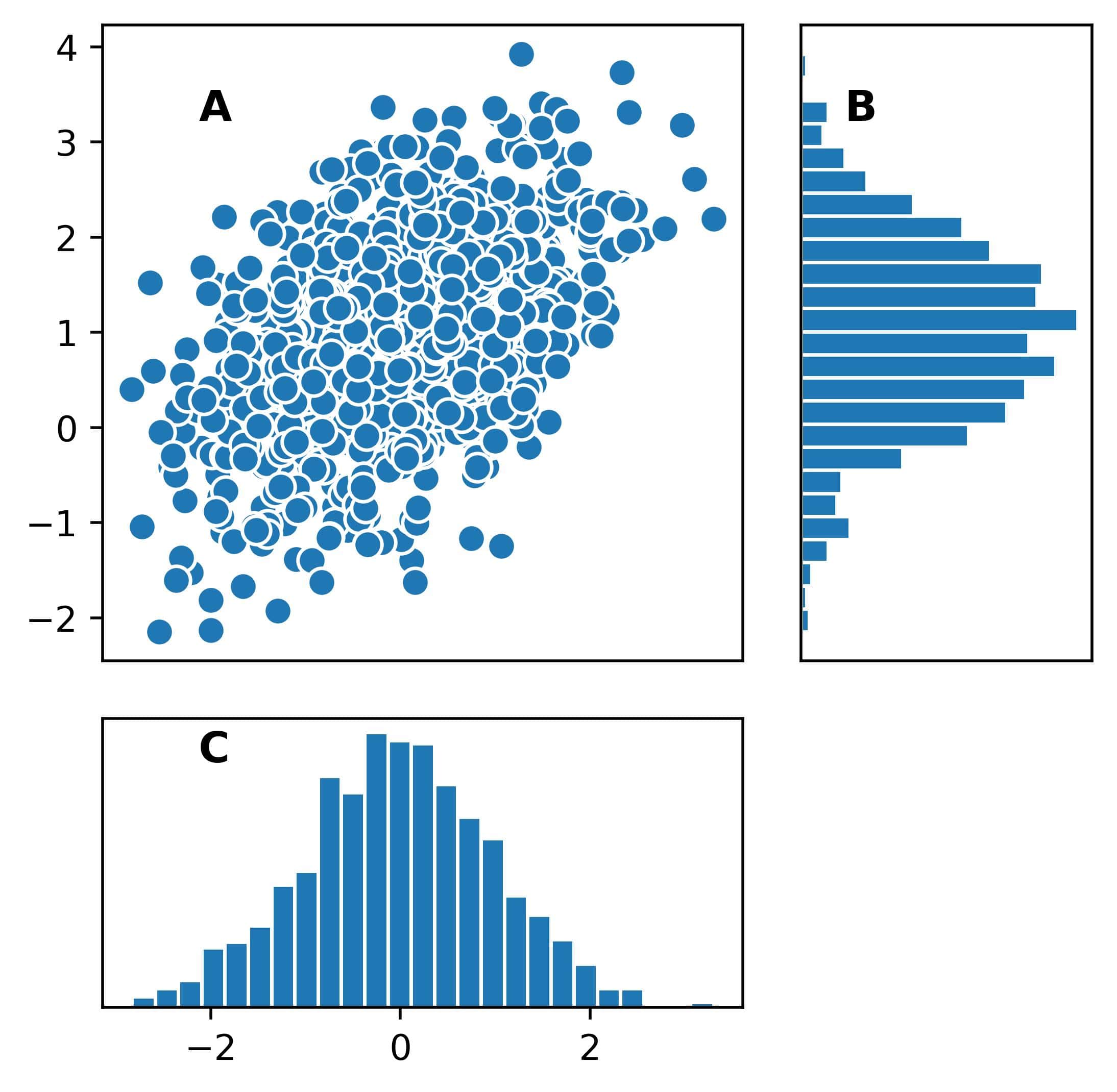
4.2. Example: Scatter Plot With Marginal Histograms
The call to subplot_mosaic() returns a dictionary whose keys are subplot identifiers and values are the corresponding Axes objects.
Let’s check out an example in which we’ll draw a 2D scatter plot and the histograms of the marginal distributions along the axes:
import scipy.stats as st
import matplotlib.pyplot as plt

data = st.multivariate_normal.rvs(size=(1000), mean=[0, 1], cov=[[1, 0.5], [0.5, 1]])

mosaic='AAB;AAB;CC.'

figure = plt.figure(figsize=(5, 5))

axs = figure.subplot_mosaic(mosaic)

for identifier in axs:
    axs[identifier].text(0.15, 0.85, identifier,
                         fontsize=12, weight='bold',
                         transform=axs[identifier].transAxes)

axs['A'].scatter(data[:, 0], data[:, 1], edgecolor='white')
axs['A'].set_xticks([])

axs['B'].hist(data[:, 1], orientation='horizontal', bins=25, edgecolor='white', density=True)
axs['B'].set_xticks([])
axs['B'].set_yticks([])

axs['C'].hist(data[:, 0], bins=25, edgecolor='white', density=True)
axs['C'].set_yticks([])
Let’s break down the code:
- First, we simulate the data from a 2D normal distribution with scipy
- Then, we specify the layout for three subplots as a string and store it in the variable mosaic
- We create a figure and pass mosaic to the subplot_mosaic() method to set the subplot structure
- To show the subplots follow the structure specified by mosaic, we show each subplot’s identifier in its top left corner using the text() method of Axes. We switch to normalized (0, 1) coordinates by using transform=axs[identifier].transAxes
- Finally, we draw a scatter plot in the subplot whose identifier is ‘A’ and histograms in the subplots ‘B’ and ‘C’
This is the result:
4.3. Parameters of subplot_mosaic()
This method shares almost all parameters with subplots(). The differences are:
- subplot_mosaic() doesn’t use nrows and ncols but infers them from mosaic.
- We can’t set sharex to ‘col’ and sharey to ‘row’ because subplots can span rows and columns.
- The parameter empty_sentinel specifies the identifier of the empty cells and is ‘.’ by default.
- We can set subplot-specific creation options using the dictionary parameter per_subplot_kw. It was introduced in the Matplotlib version 3.7 and can override the global settings specified by subplot_kw that are common to all subplots.
5. Other Methods
Matplotlib offers other techniques for drawing multiple subplots in the same figure.
For example, the add_subplot() method of Figure adds subplots one at a time. We can use it in several ways:
figure = plt.figure(figsize=(5, 5))

ax1 = figure.add_subplot(2, 2, 1)
ax2 = figure.add_subplot(2, 2, 2)
ax3 = figure.add_subplot(223)
ax4 = figure.add_subplot(224)
The grid and the subplot’s position can be specified via an integer triplet (nrows, ncols, index) or as digits of a three-digit integer if there are <= 9 subplots. The index is 1 in the top left cell and grows from left to right, top to bottom.
This method is used internally by the function subplot() from matplotlib.pyplot.
We can use GridSpec to control the grid more advancedly. This class specifies all the details of a grid’s layout, which we can pass to Figure. The mosaic and rectangular layouts in subplots() and subplot_mosaic() use it internally.
6. Conclusion
In this article, we showed two ways to create figures with multiple subplots in Matplotlib: subplots() for rectangular and subplot_mosaic() for mosaic layouts (with subplots spanning cells in several rows or columns).
These two methods should suffice for most simple and quick uses. However, for more advanced use cases, such as nested and very complex layouts, we resort to more powerful lower-level alternatives.